ILANAAQ the INUKSHUK
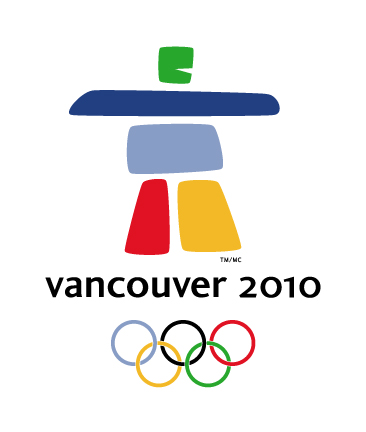
Earlier this Week the International Olympic Committee revealed the New Mascot for the Vancouver 2010 Winter Olympics. The design is modeled after an "inukshuk", which are stone landmark and navigational monuments created by the Inuit people of the Arctic Circle.
The hulking stone figure of a man has been named "ILANAAQ" which is the Inuit word for friend.
- I dunno, but I'm not a huge fan of this one. I find it really simplistic and definitely unsporty... It is just so... bulky... and cartoonish. Blah.
I am also in full agreement with those who think, simply, that if the Olympics are being held in British Columbia, why wouldn't you have a more West Coast theme, as opposed to an Arctic one? It seems out of place as the Games are being held in an area that is pretty much a rainforest flanked by huge mountain peaks. (So Therefore, if we are talking "West Coast Themes", perhaps a Canucks Orca Whale jumping in front of an Olympic colored stylized Pot Leaf with Raindrops might be more fitting.)
I suppose I will just have to get used to it as it will be plastered on every godforsaken piece of literature and signage from all of the hundreds of sponsors for the next 5 years, let alone the millions of T-shirts, posters and other consumer crap for the next 10.
Oh Ilanaaq - you big ol' pillar of strength - From this point on you will be in the hearts and minds of all British Columbians whether we like you or not.

posted by Connie @ 1:01 AM
![]()
![]()


4 Comments:
I agree....I banged my head against the wall a couple of times to try and see if I could come to a conclusion as to why they would use an Inuit symbol in Coast Salish Territory. All I got was a bump on my head.
I sat here and wrote this giant statement on why I think it is inappropriate and then a collague walked in and started asking me about what could connielingus possibly be - so I had to exit out of my post... bastards!
Anyways - I think it's terrible. We could have done a hundred times better if we'd simply hired a herd of caribou to run over a marked area and from that pattern created a background that would simply have two lines crossing representing mountains and a maple leaf at the top of said mountain.
I can't believe that this is what came out of the creative minds of canada's professional graphic designers - how is that possible! Doesn't someone own this as copyright material already - don't the Inuit just own it - out right own it - Vancouver will pay for this - if I was a lifer from canada's north shore I'd be putting in a lawsuit against the bastard who said this was creative thought - creative thought my ass! my ass! and one more time... MY ASS!
Ok - there is my rant for this afternoon. Thank you :) Thank god its friday!
Thank God..... get me a cider.
Whoa Ape! rough day at the office eh!
I totally agree with you.... It feels like we should have had some sorta vote as to if we the people actually liked it. Like I said, we are going to be seeing the damn thing everywhere now.
- there was a cartoon in the newspaper the other day with the inukshuk dude upside down saying "For all those who hate the new emblem - just turn it upside down and its a rabbit on a snowboard!"
Post a Comment
<< Home